Case study: FI APP
The FI (financial independence) app was developed as part of the Google UX Design Professional Certificate
The assignment was to design an app that teaches users how to save and budget their funds.
My role: UX/UI designer, researcher.
Project overview
The problem:
The lack of financial literacy results in many people from all walks of life, including those in high-paying jobs, being unable to afford buying a home, save for their retirement and support themselves and their families if they lose their job.
The goal:
Develop an app that helps people learn about saving and budgeting, as well as keep them accountable and set them on course to their financial freedom.
Understanding the user
User persona: Daisy

User persona: James

User journey map
The journey to financial literacy is simple but not easy. As designers of a budgeting app, we need to ensure that features such as accountability tracking and rewards are included in the design process. We also need to make the experience of using the app playful and motivating.
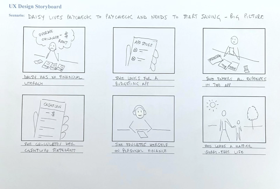
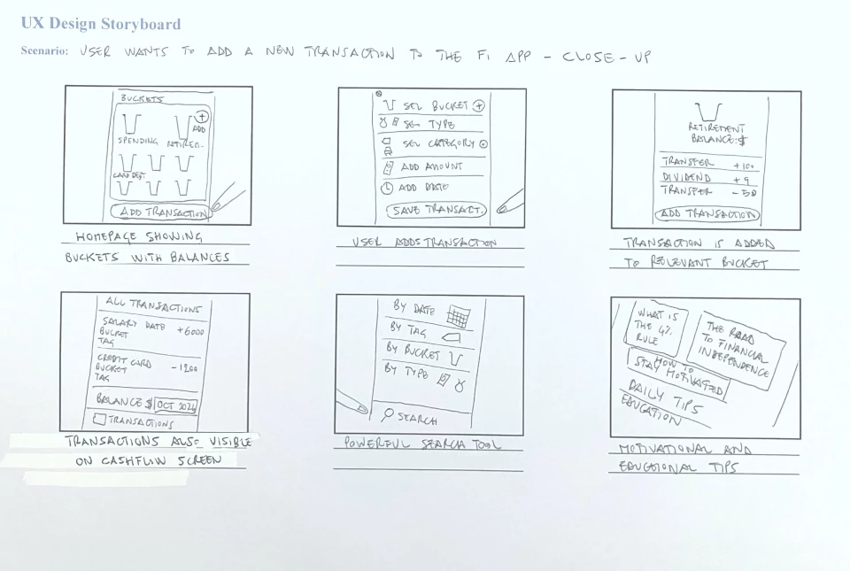
Storyboards – Big picture and close-up
Paper wireframes
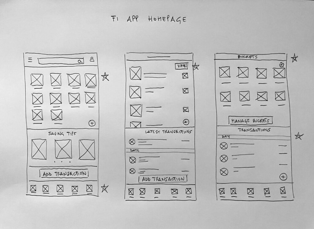
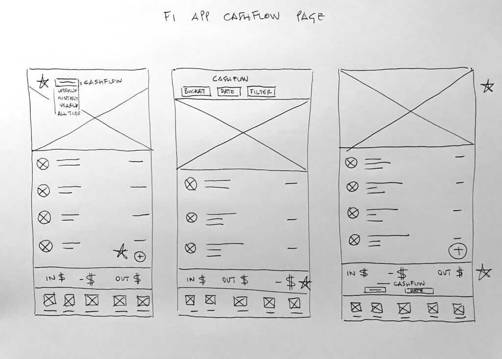
A few iterations of two of the main pages of the FI app. I strived for simplicity and ease of use, progressively removing unnecessary and unjustified elements.
Digital wireframes
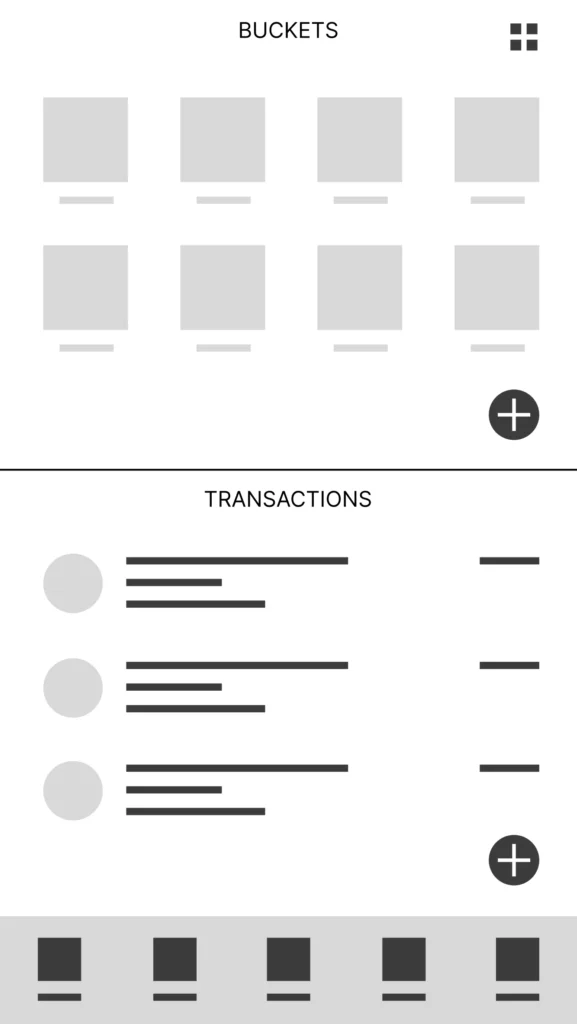
Wireframe of the homepage of the FI app.
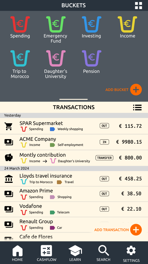
The buckets section of the app provides a bird’s eye view of the user’s financial life. This simple and tidy visual categorization into buckets is meant to convey a sense of stability and atteinability of the user’s financial goals.
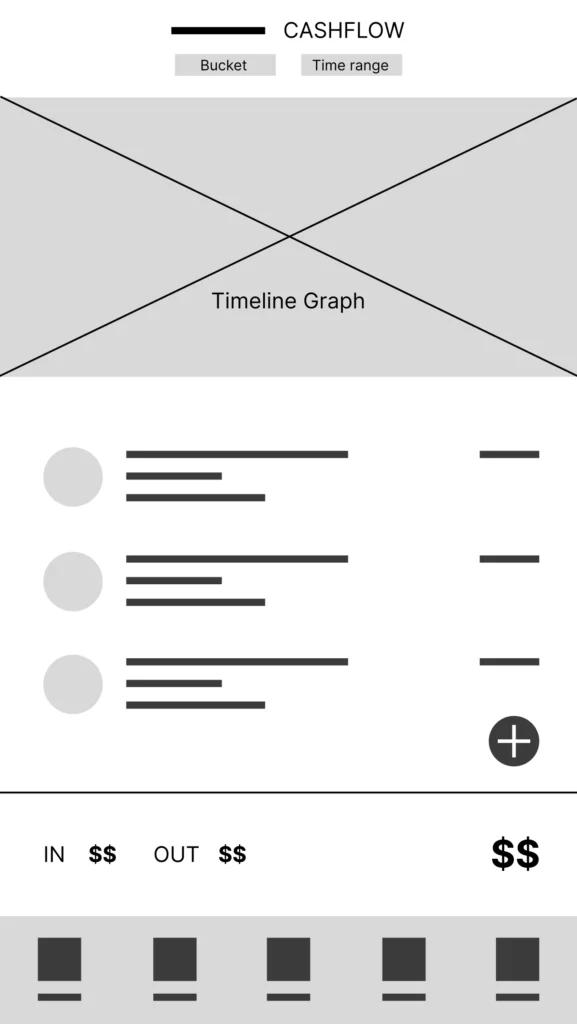
Wireframe of the cashflow page.
The cashflow page allows for a simple assessment of the user’s financial situation. It can be customized by time range (monthly by default) and financial bucket (e.g. credit card debt).
User flow
User flow chart of transaction logging.

Low-fidelity prototype
Try the Figma low-fidelity prototype here.
Usability study findings
1
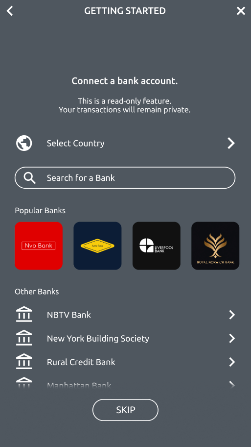
Users want a ‘Link bank account’ feature to avoid having to enter every transaction manually.
Participants in the usability study highlighted that entering every single transaction manually was tedious and would make them abandon the app. I therefore decided to add a ‘Connect bank account’ feature, allowing users to import transactions from financial institutions via APIs.
2
Users need a tutorial on the utility of financial buckets.
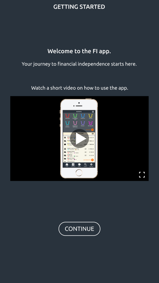
Participants in the usability study highlighted that the could not wrap their heads around financial buckets. I therefore decided to create a ‘Getting started’ section which includes a short video on how to use the app.
3
Users need education on cashflow statements and balance sheets.
The Learn tab in the app will provide educational blog posts and videos on personal finance, as well as motivational material such as challenges and rewards to keep them accountable along their journey to financial independence.
Mockups
High-fidelity prototype
Try the Figma high-fidelity prototype here.
Accessibility considerations
1
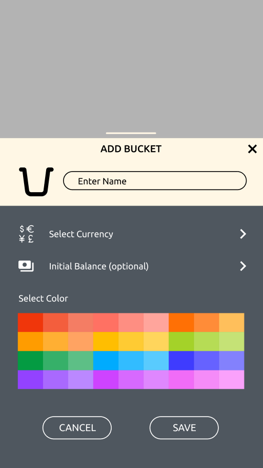
Text was added to the ‘Add Bucket’ and ‘Add Transaction’ buttons to make them more accessible to first-time users and less technology-savvy people.
2
I added an introductory video as part of the sign up process to get first-time users started with the app. The video will include closed captions in different languages.
3
In order to respect users’ privacy, personally identifiable information like name, gender and financial history will not be collected in the app. It will be possible for users
to utilize the app without a Profile section.
